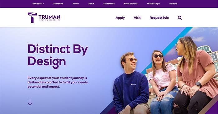
Truman Website Gets Refreshed Look

Regular visitors to the Truman website may have noticed a new look recently.
In keeping with the University’s refreshed brand guidelines, Truman webpages are in the process of being updated with a new look. The University rolled out the first phase of changes the week of May 18 when the homepage and top-level pages were converted to a newly refreshed design that reflects the University’s new visual brand and a contemporary look.
Working closely with SME, the branding firm Truman has collaborated with throughout the process, a team composed of members from ITS, admissions, marketing and public relations spent several months planning the new website design.
With a trend toward the primary use of mobile devices, the new design was developed to adapt to tablets and phones with the same functionality available on a desktop. It also represents a large step forward in the University’s ongoing efforts to make the website accessible to everyone. All of the previous resources are still available on the updated pages.
This summer, the rollout plan for the website design will continue with the second phase which includes transitioning additional sites to the new look and updating content and visuals. The goal is to provide a consistent look and feel as users navigate through all Truman websites.
If visitors find any issues on the website they would like to report, or have suggestions, use the Website Feedback Form.

